Natural icons of design


The local environment, culture and technology combine in Games' vibrant graphic design schemes, Ma Zhenhuan reports
"Meeting the World" and "Harmony of Colors", the core graphics and color schemes of the 19th Asian Games, blend elements of silk and internet technology in a beautiful array of designs.
They convey a key message of unification for the Olympic Council of Asia members, as well as representing the vibrant, modern city of Hangzhou, according to the chief designers.
Incorporating elements of sports, Chinese culture, and Hangzhou with international aesthetics, the design of the core graphics and color schemes mirrors the visual signage of the Games' emblem, mascots, slogan, and sports pictograms. Altogether, they create the overall atmosphere and main aesthetic of the 19th Asian Games.
The core graphics scheme, "Meeting the World", draws inspiration from silk, a quintessential cultural element of host city Hangzhou. Hailed as a paradise on earth by Italian explorer Marco Polo, the city was a key link on the Maritime Silk Road.
"The idea is derived from mountains and rivers in Zhejiang, as well as smart-cloud computing, Hangzhou's backbone industry," said Cheng Zhaohui, designer of the core graphics and professor at the China Academy of Art.
With Hangzhou considered China's "internet capital", the design team added different-colored spots, which can be superimposed to create a surface similar to a visual representation of a cloud network, Cheng said.
Entitled "Harmony of Colors", the color system is dominated by Rainbow Purple and complemented by Glowing Red, Mist White, Laurus Yellow, Glimmering Blue, and Lakeand-Mountain Green. Varying hues not only merge into each other through juxtaposition and overlapping, but also add luster to Rainbow Purple.
Compared with the previous edition of the Asian Games, this time the colors are presented as a gradient, according to Guo Jinyong, the designer of the color scheme.
Guo said the colors appear to morph if viewed under different lighting.
"Poetry is the source of inspiration for our creation. The main idea of 'Harmony of Colors' comes from a poem by Su Shi, a poet of the Song Dynasty (960-1279). The poem reads: 'West Lake may be compared to Xi Shi (one of the "four beauties" in ancient China); Whether she is richly adorned or plainly dressed'," said Guo.
Each color was inspired by a poem describing Hangzhou.
Rainbow Purple was inspired by a line by Tang Dynasty poet Bai Juyi (772-846). "At sunrise riverside flowers more red than fire; In spring green river waves grow as blue as sapphire," the poem in question, Memories of Jiangnan, reads.
Glowing Red was inspired by the transient twilight described in The Lakeside Temple at Dawn, written by Song Dynasty poet Yang Wanli (1127-1206): "Green lotus leaves outspread as far as boundless sky; Pink lotus blossoms take from sunshine a new dye."
Glimmering Blue, the color of clear skies and water ripples, was inspired by the Su Shi line: "The brimming waves delight the eye on sunny days; The dimming hills present a rare view in rainy haze."
Laurus Yellow, representing the laurel flower and fragrance, was also inspired by Bai's poem.
Lake-and-Mountain Green was cited in a line from a poem penned by Gong Zizhen, a literary master in the Qing Dynasty (1644-1911).
Mist White was inspired by the poetry of Liu Yong (987-1053), from the Northern Song Dynasty (960-1127).
The color scheme with its silk-themed core graphics showcases time-honored Oriental aesthetics.
The designers also wanted people to consider the colors' impact in unity, hinting at the importance of solidarity during the Asian Games.
The core graphics and color system have been applied to venue decoration, TV broadcasts, ceremonies, cultural activities, urban landscaping, vehicles, uniforms, tickets and licensed products, according to the Hangzhou Asian Games Organizing Committee.
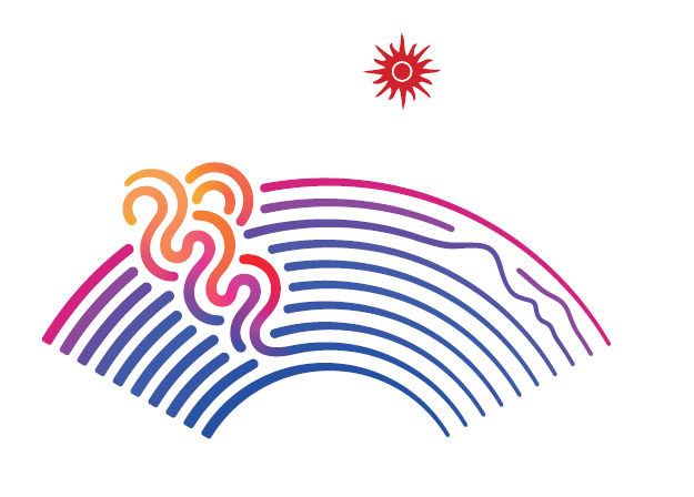
"Surging Tides" — The emblem
Designed by Yuan Youmin, a student at China Academy of Art, the emblem consists of six elements: a Chinese fan, the Qiantang River, a tidal bore, a running track, the Wi-Fi signal icon and the glowing red sun of the Olympic Council of Asia (OCA). The fan represents the cultural heritage unique to the southern regions of the Yangtze River. The Qiantang River and a tidal bore are the core elements of the emblem, showcasing the natural landscapes of Hangzhou and the courage of the people. The running track represents the sports themselves. The Wi-Fi signal icon illustrates that Hangzhou is a national hub for the digital economy.
The emblem symbolizes that the great cause of socialism with Chinese characteristics in the new era is gathering greater momentum and the unity of the OCA Family, marching forward, hand in hand. According to the Hangzhou Asian Games Organizing Committee (HAGOC), the emblem embodies the character of our times and the Olympic spirit. Original and highly recognizable, the emblem also underscores the host city's profound heritage and singularity, expressing people's aspirations for staging a successful Asian Games and building a community of a shared future for Asia and mankind.
Most Popular
- PGA Tour discussing bracket-style championship
- Slot defends Alexander-Arnold after poor display
- Dembele strike clinches Champions Trophy for PSG
- Amorim the 'only guy upset' after spirited Anfield display
- Diallo torments Liverpool with late goal
- Matsuyama breaks PGA Tour record, wins The Sentry


