 |
|
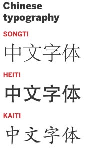
Chinese topography [Photo provided to China Daily] |
The Chinese writing system is among the oldest in the world, stretching from the script carved on oracle bones during the Shang Dynasty (c.16th century-11th century BC) to text typed on today's computers.
Although the characters have evolved from pictograms to become more simplified, most Chinese would have no difficulty in recognizing many of the progenitors of current characters that go back hundreds of years.
Just as English words are made up of letters that in turn consist of strokes, Chinese characters are built using strokes, but that is about where the close similarity between the two writing systems ends.
For anyone learning Chinese calligraphy, the character yong, meaning forever, is regarded as the one par excellence to practice because it contains the eight most common strokes that are part of almost all the characters.
After strokes, the basic building blocks of most characters are radicals, which consist of several strokes that in isolation represent a root meaning. These radicals are combined with other characters, producing thousands of combinations. In many cases one of the building blocks used in making these characters acts as a pointer to how it is pronounced.
However, because of changes in language over the centuries this is far from a sure pronunciation guide, and the fruits of any guesswork may be mere embarrassment. Thus the saying that a mediocre scholar reads unfamiliar characters by half.
There is such a thing as a Chinese typewriter, but it has never been widely used because of the sheer volume of characters. So before the mass use of computer pinyin input software that has come in since the advent of personal computers, Chinese were apt to do a lot more handwriting than their Western counterparts.
That is why handwriting continues to be emphasized in Chinese education, and being able to write beautifully with a personal style is considered a mark of honor, and an idiom has it that in seeing a person's handwriting you see the person.
After the popularization of the personal computer, convenient Chinese input software based on pinyin, word processor and internet, digital Chinese typefaces are the latest innovation.
There are about 1,000 Chinese typefaces, perhaps the most commonly used being Songti, as well known and recognizable among Chinese as the Latin typeface Times New Roman is among Westerners. Its name comes from the Song Dynasty (960-1279), when woodblock printing was no longer limited to printing Buddhist sutras, but also used for the large-scale publication of books on the classics, books of literature, and school textbooks.
For the convenience of carving characters in wooden blocks, the carver used straight lines to replace curves but retained handwriting features by adding a serif-the horizontal stroke that adorns the bottom of the letter f here.
To this day, most newspapers and books in China are printed in Songti or variant typefaces of the Songti family. In computers this typeface can be found under the name SimSun in the Windows system or STSong on Mac.
Heiti is a widely recognized Chinese sans-serif typeface similar to the Latin typefaces Helvetica and Arial in that it is devoid of those small adornments at the ends of certain strokes. It was invented in the early 20th century.
The strokes in Heiti are uniform in their width and have a weightier, blockier and bolder look that does Songti.
Heiti was used more often in titles and posters when it was first invented. But it has become a popular typeface by dint of Microsoft using a variation of it for the past 10 years in website design.
The typeface Kaiti is named after a style of calligraphy that originated during the Eastern Han Dynasty (25-220), peaked in the Tang Dynasty (618-907) and became the regular script of handwriting in China. Anyone wanting to study calligraphy will be told to start by imitating Kaiti.
Kaiti, with a breezy style that mimics handwriting, is often used to appeal to readers on a warm, personal level.
|
|
|
|
|
|
|
|
